Worms and wings, meatballs and swooshes: NASA insignias in popular cultureby Glen E. Swanson
|
| But just last month, NASA Administrator Jim Bridenstine announced “the worm is back.” |
The coming and going of NASA’s symbolic identity can get confusing. In addition, over the past several years there has been an increased visibility of NASA emblems, both the worm and the meatball, with many it could be argued not having a clue as to what exactly they represent. You see NASA logos on apparel, backpacks, and other novelties, not to mention frequent appearances in television and motion pictures. NASA has become a brand and all this new attention given to its old insignias begs the question of how this came to be. This article will take a look at the origins of the NASA logos as well as explore possible reasons for why they remain popular as a brand.
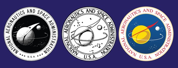
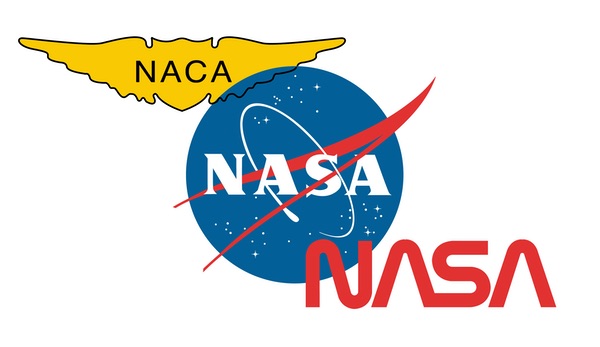 The design evolution of the NASA insignia began with the wings of the National Advisory Committee for Aeronautics, NASA’s predecessor. NASA then had the “meatball” starting in 1959 followed by the “worm” in 1975. (credit: NASA) |
Before the Meatball there were Wings and the Seal
The earliest known emblem related to America’s space program originated with the National Advisory Committee for Aeronautics. The NACA, pronounced “en ay see ay” was founded in 1915 by the federal government to conduct aeronautical research. Their emblem consisted of a simple set of gold aviator’s wings with the agency’s acronym spelled out in black letters set in the middle.
On October 1, 1958, the NACA was dissolved and replaced by the newly formed National Aeronautics and Space Administration. Since NASA was a civilian agency it was determined that the more military looking NACA design should be replaced.
“It all started in 1959 when NACA Executive Secretary John Victory sent out a letter to Ames, Langley and Lewis Laboratories for suggestions for a NASA seal,” recalls James L. Modarelli during a series of interviews that I conducted with him at his home back in 1992.[2]
Modarelli had a long and distinguished career that began after he graduated from the Cleveland Institute of Art in 1949. Shortly after graduation he began work as an artist-designer at what would eventually become the NASA Glenn Research Center.
After the NACA was absorbed into NASA, employees were invited to submit ideas for the new Agency’s seal. “I was head of the Research Reports Division at Lewis and we sent in a few designs,” Modarelli explained when he recalled the origins of the NASA seal.[3] In addition to the design submitted by Modarelli, ideas from Ames and Langley were also sent in. Six designs were chosen as finalists before the one submitted by Modarelli and his team from Lewis was judged to be the best.
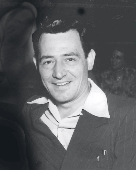 James Modarelli, the NASA graphic designer who created the original NASA seal and insignia. (credit: NASA) |
In July 1958, the NACA held a Triennial Inspection of the Ames Laboratory. During this time, invited guests including members of the scientific community as well as engineers and staff from other NACA field centers, discussed research and reviewed facilities.
| When the completed design was sent to the Army Heraldic Branch and the Commission of Fine Arts for review, it was discovered during the approval process that the red wing was drawn upside down. |
Modarelli attended this meeting where he viewed a wind-tunnel model of a radical supersonic airplane design. The unique aircraft featured a cambered and twisted arrow wing with an upturned nose. “I’ve heard it referred to as a ‘V-shaped wedge,’ or a ‘vector’ but it is neither,” said Modarelli when I asked him about the shape that inspired the design he used for NASA.[4] It turns out that the red “V” was based upon an actual wind-tunnel model of an early hypersonic wing design.
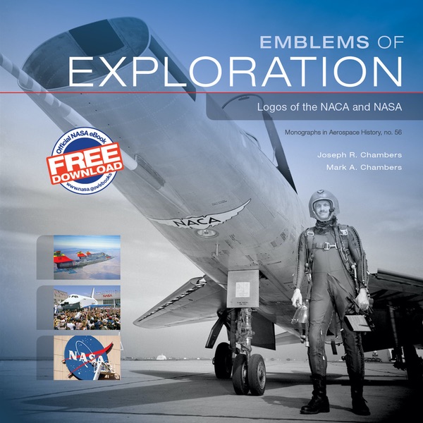 This NASA monograph was published in 2015 and offers an excellent overview of the history of NASA’s emblems. (credit: NASA) |
In 2015, Joseph R. Chambers and his son Mark co-authored Emblems of Exploration, a NASA monograph detailing the history of the logos of the NACA and NASA (see “Review: Emblems of Exploration”, The Space Review, December 14, 2015). The book details the process involved in creating NASA’s symbolic identity. One of the more interesting stories offers a possible explanation as to why the unique red “V” appears that color in NASA’s emblems. Chambers explains that wind tunnel tests were done using various configurations of the hypersonic wing that Modarelli first saw at Ames. A model of a bomber using the wing design was created in red plastic and placed on display at one of the engineer’s offices at Langley.[5] When I asked the authors of the NASA book if Modarelli may have been inspired by seeing the Langley model to make that graphic element in his NASA emblems red, author Joseph Chambers replied, “There’s little question in my mind that the red coloring must have influenced Jim in his final decision of what he wanted the thing to look like.”[6]
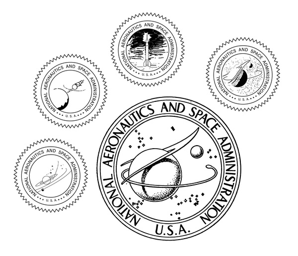 Sketches showing four of the six design finalists for the NASA Seal. The winning design submitted by James Modarelli and his team from Lewis is shown enlarged. (credit: NASA) |
The Chambers monograph also tells how the NASA seal was almost approved incorrectly. When the completed design was sent to the Army Heraldic Branch and the Commission of Fine Arts for review, it was discovered during the approval process that the red wing was drawn upside down. When word of the mistake reached NASA Headquarters, work by the Heraldic Branch was halted while Modarelli corrected the problem. During this time, he also took the opportunity to make other adjustments not only to the wing but also in how its shadow was cast onto the globe. Changes to the small sphere were also made along with other minor color adjustments. The elliptical path of the space vehicle was changed and the size and location of the stars were modified.[7]
On November 27, 1959, President Eisenhower signed Executive Order 10849 establishing the design as NASA’s official seal. The seal’s design was amended again in 1961 during the Kennedy administration when the color of the shadow on the big sphere was changed from gray-blue to brown.
 The sketch on the left shows an upside down wing in the NASA seal that was erroneously sent to the Army Heraldic Branch and the Commission of Fine Arts for review. The sketch on the center has been corrected. Note the revised hypersonic wing attitude and shape, omission of the stars, enlargement of the letters “U.S.A.” in the border, altered star patterns and modified shadow pattern on the globe. To the far right is the final version of the NASA seal shown in color. (credit: Institute of Heraldry, Department of the Army and NASA) |
The NASA Meatball
Because the seal could only be used for official applications, NASA’s first administrator, Dr. T. Keith Glennan, asked Modarelli to design an insignia for a more informal identification of the new agency.
During my 1992 interview Modarelli remarked, “After the seal was done, Glennan came back to me… He said ‘look, we can’t use the seal for unofficial kinds of things like ashtrays, lapel emblems and things like that. Come up with an insignia.’”[8]
| “After the seal was done, Glennan came back to me… He said ‘look, we can’t use the seal for unofficial kinds of things like ashtrays, lapel emblems and things like that. Come up with an insignia.’” |
At first, an ad hoc committee at NASA Headquarters submitted four very simple designs that were variations of the letters “N-A-S-A” encircled by an orbiting body.[9] These were almost immediately rejected as being far too simplistic. What followed was an announcement sent to all the NASA field centers and headquarters inviting others to submit ideas. This resulted in more than 350 submitted designs.[10] These other designs most certainly influenced Modarelli but he also wanted to create an insignia that included stylistic elements present in the NASA seal. In describing the design of the seal Modarelli explained to me, “I chose the main elements from the seal – the sphere, representing a planet; stars, representing space; the wing, representing aeronautics; and an orbiting spacecraft. Then I added the letters: N-A-S-A.”[11]
By April of 1959, NASA formally notified the Heraldic Branch of the Army Office of the Quartermaster General that it would use the insignia design created by Modarelli. On July 15, 1959, Glennan announced the new NASA Insignia in the NASA Management Manual.
Chambers points out that the insignia had actually been approved before the seal. He notes that Modarelli worked on the insignia design while completing the seal design and even though the seal design was completed by March of 1959, it was not approved until November.[12]
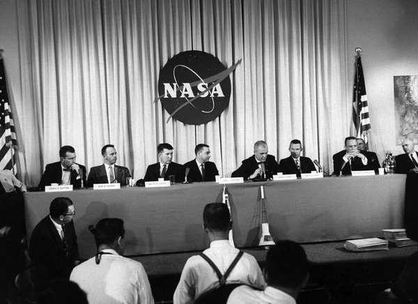 The April 9, 1959 press conference revealing America’s first Mercury astronauts was also the first public unveiling of NASA’s emblem. Note that the white orbit is not shown correct as it should orbit above the “S” and red vector. The white orbit “blob” is also in the opposite position. (credit: NASA/LIFE) |
Affectionately known later as “the meatball,” the new NASA insignia saw extensive use throughout NASA’s space program. During the first public appearance of the original “Mercury Seven” astronauts in 1959, the new insignia can be seen prominently displayed as a huge backdrop above and behind the seated astronauts. For the general public, this was the first time that most had seen the new NASA insignia.
From the Mercury through Apollo Programs, the meatball was attached to the astronauts’ spacesuits and flight suits above the right or left breast. Over time, there were slight variations in the appearance of the insignia. The arrival of the Apollo Program brought one of the more noticeable changes. The white border surrounding the original NASA design was eliminated and replaced with royal blue that matched the royal-blue background of the emblem. The red extended vector remained but lacked its original white border. This modified version can be seen on many of the training gear, flight wear, jackets and spacesuits used by the astronauts during the lunar landing program.
Beginning in the 1990s, NASA adopted an unofficial modification to the meatball that was applied to its various research aircraft. Called the “swoosh,” the design is a less complex variation of the original meatball insignia. The new variation removed the circular blue background and most of the fine details such as the stars, but left the red supersonic wing, the orbiting spacecraft, and, of course, the letters “NASA.” JSC began applying this new design to the tails on its fleet of T-38 aircraft used by astronauts for training and travel. The design proved popular. Soon, other NASA centers took notice and began adopting the same marking for their aircraft fleets.
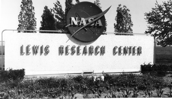 One of three gate signs originally installed at NASA Lewis Research Center in 1966. (credit: Jim Modarelli and Glen Swanson) |
The NASA Worm
By the mid 1970s, it was decided that the original NASA meatball insignia would be replaced by a more contemporary design. This was arguably justified in part by the fact that the original insignia was not only difficult to accurately reproduce and apply to various media but also because many of the finer details of the design were hard to distinguish at a distance.
| The division over those who preferred the meatball versus the worm seemed to have separated older NASA workers from younger ones with no middle ground. |
President Nixon, in a 1971 memo, directed the heads of all the federal departments and agencies to consider how the arts and artists might “be of help to your agency and to its programs.” The overwhelming response was that the federal government needed better offices and better graphics. The following year, the National Endowment for the Arts initiated the Federal Design Improvement Program. This program for upgrading federal designs included the Federal Graphic Improvement Program, which consisted of a panel of prestigious graphic designers who convened to critique the graphics of participating federal agencies. Ultimately, more than 45 government agencies revamped their graphics under their guidance including NASA and the US Postal Service.[13]
Under this program, NASA chose their new logotype to be designed by the New York firm of Danne and Blackburn, the same firm that designed America’s bicentennial logo that first adorned the side of NASA’s giant Vehicle Assembly Building at the Kennedy Space Center.
In a 2011 article that appeared in the New York Times, Richard Danne described the new streamlined design as “clean, progressive, could be read from a mile away, and was easy to use in all mediums.” In the same article, he also recalled how NASA Administrator James Fletcher and Deputy Administrator George Low had misgivings about the new design when it was first revealed to them during a meeting in 1974:
Fletcher: “I’m simply not comfortable with those letters, something is missing.
Low: “Well, yes, the cross stroke is gone from the letter A.”
Fletcher: “Yes, and that bothers me.”
Low: “Why?”
Fletcher: (long pause) “I just don’t feel we are getting our money’s worth!”[14]
The new design was controversial, to say the least, when officially adopted by NASA in 1975. It was during this time that NASA’s original insignia was first dubbed “the meatball” by Fran “Red” Rowsome, head of technical publications at NASA Headquarters.[15] This was done in part to distinguish it from the new logo that was officially called the “NASA logotype.” Others simply called the new design “the worm.”
| One of Goldin’s staff members looked at the worm emblem and asked, “Why in the world do we have that awful logo?” |
“There was all sorts of flak that occurred between the different centers over the design change,” recalled Modarelli when I asked him in 1992 about the new logo. “Many hated the new design. I remember Red Rowsome up at headquarters sent out a very tongue-in-cheek memo that seemed to sum up the feelings of what many felt about what the panel from the National Endowment for the Arts produced.”
The panel from the National Endowment for the Arts which has produced the new NASA logotype is to be congratulated on its perception and subtlety in capturing the innate spirit of the new NASA. The Letters N-A-S-A scrawled in red tape are eminently appropriate. The strokes are all one width, giving a feeling of drab monotony and narrow-minded orthodoxy. This treatment is also symbolic of wet noodles, indicative of the impact this whole project is likely to have on the public at large. Elimination of the cross-strokes in the A’s symbolizes the administration’s preoccupation with big-time management and the resultant repression of such minor details as technical excellence and original thought. The resulting “nose-cone shapes” within the logotypes impart a feeling of “upward mobility” or snootiness or something.* If this symbol were now placed upon a brown background, it could be described in terms of traditional heraldry as “Bureaucracy rampant upon a field of appropriate material.”
*The design panel refers to this as a feeling of “vertical thrust,” but this expression conveys certain obscene connotations which would not appear to be in the best interests of the administration.[16]
The division over those who preferred the meatball versus the worm seemed to have separated older NASA workers from younger ones with no middle ground. Folks either liked the new design or hated it. Whatever their allegiance, the worm remained NASA’s official insignia for nearly 17 years until a new administrator decided to change that.
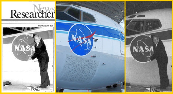 The left photo shows the controversial picture of Goldin taken by Langley photographer Fred Jones as it originally appeared on the front page of the June 5, 1992 issue of the Researcher News, NASA Langley’s official in-house newspaper. The center photo shows a close-up of the nose of Langley’s Boeing 737-100 with its air data probes surrounding the meatball that Goldin was pictured standing next to. To the right is the same photo of Goldin after being digitally altered by NASA. (credit: NASA) |
The Meatball is back
On May 22, 1992, Daniel S. Goldin arrived at NASA Langley for his first tour of the center as the agency’s new Administrator. According to Chambers, Goldin’s plane taxied toward the hangar that prominently displayed both a giant NASA worm and the meatball above the hangar doors. One of Goldin’s staff members looked at the worm emblem and asked, “Why in the world do we have that awful logo?”[17]
Upon arrival at the Center, Chambers states that Goldin asked his special assistant, George W.S. Abbey, and the director of Langley, Paul F. Holloway, for ideas on what he could do to improve what he felt was sagging morale among NASA employees. NASA was still reeling from the loss of the shuttle Challenger that occurred six years earlier. In addition, there were troubles with the newly launched Hubble Space Telescope and continual problems with the shuttle program in general. On top of all of this, NASA’s previous administrator, Richard Truly, was fired only a few months before Goldin’s visit. So a lot of things were on the minds of the NASA workers that assembled to hear Goldin speak that May at Langley.
Chambers describes how Abbey suggested that Goldin “restore the meatball” to help lift spirits. Holloway agreed and explained how he had to get a ridiculous amount of paperwork done to allow him to include the meatball on his personal business cards. Abbey added that the same requirement existed for the astronauts who sought to wear the meatball on their flight suits and jackets.[18]
As Goldin addressed the employees at Langley he spoke about the “new NASA” and its commitment to restore the technical and managerial excellence that made NASA the “hallmark of the world in the ’60s and ’70s.”[19]
Included in his comments was a surprise announcement declaring that the meatball would return as the official NASA insignia. As Goldin’s speech came to a close, the “re-heating” of the meatball signaled, “The can-do spirit of the past is alive and well.”
Like the response to the announcement 17 years earlier when the NASA worm replaced the meatball, there were those who supported the return of the meatball and those who did not.
Lawrence J. Reeves, head of a California-based aerospace contractor, wrote in support of the change stating, “My space community colleagues, including some who started the civil space program, seem to endorse Mr. Goldin’s vision of the future and his sensitivity for preserving its technological past.”[20]
One of the more vocal critics against the switch back to the meatball came from the National Endowment for the Arts (NEA), the agency that pushed to have the worm design created in the first place. Mina Write Berryman, the director of the NEA, expressed her dismay over Goldin’s decision in a strongly worded letter to the Administrator:
The worm is not simply a logo, but an integral part of NASA’s comprehensive visual standards program. This program was developed by NASA in 1975 following an extensive review of the agency’s graphics by a Federal Graphics Improvement Panel convened by the Design Arts Program. The panel of graphic designers found that NASA’s graphics did ‘not remotely relate to what NASA does’ and had no visual unity; they recommended that NASA develop a graphic standards manual. The manual was developed in consultation with the design firm of Danne & Blackburn and through consistent applications of its standards over the last 17 years, NASA has produced one of the most successful federal agency visual communications programs. In 1984, this program was awarded a Presidential Award for Design Excellence, the highest award in design given by the president. NASA is the only federal agency to have received this prestigious honor… Before jeopardizing its entire visual communications program, we recommend that NASA undertake a professional evaluation of the program and of NASA’s visual communication needs.[21,22]
In a letter posted in the July 27–August 9, 1992 issue of Space News, Dan Dolling wrote of his disapproval over the NEA’s decision to try and retain the worm, stating that they “obviously cannot tell an airfoil from a hole in the ground. The old NASA logo does represent the agency and its work—aerial flight, space travel and the whole universe. NASA’s people might not know art, but they know what they like: meatballs, not worms.”[23]
| “My friends at other NASA centers said they had to go room to room with black electrical tape covering the worms on property tags on desks, furniture, whatever.” |
In spite of the great NASA worm rush of 1975, most of the NASA centers retained their original meatball markings because of high costs associated in making the change to the worm. For example, NASA Lewis had a huge metal meatball insignia that greeted visitors at its entrance. The sign had been there for decades and now with Goldin’s mandate, the center had no reason to remove it.
Many of the NASA aircraft were never “de-wormed” because they still retained their original meatball markings at the time of Goldin’s announcement. It was argued that such changes to NASA’s aircraft fleet liveries would have been prohibitively expensive.
One particular aircraft however, a Boeing 737 used by Langley, unwittingly found itself at the center of attention during Goldin’s “meatball is back” announcement.
In the early 1970s, Langley acquired the very first Boeing 737 ever built. The 737-100, or “Baby Boeing” (tail No. 515), would go on to serve as a highly productive research aircraft used by NASA. Boeing eventually went on to produce more than 10,000 of the 737 jetliners, making it one of the most successful aircraft ever produced by the Seattle-based company.
When the aircraft arrived at Langley in 1973, flight operations painted a meatball on the nose and “NASA” in black and gold markings on the tail. After the 1975 logotype replaced the meatball, Langley painted the NASA worm on the tail but left the meatball as is on the nose.
During Goldin’s May 22, 1992, visit to the Center where he proclaimed the return of the meatball, the administrator posed for photos. One of the photos showed him hugging the giant meatball emblem painted on the nose of Langley’s 737. NASA published the photo on the front page of the Researcher News, the Center’s in-house newsletter.
Photographers caught not only Goldin and the meatball in their picture but also one of the aircraft’s air data probes. The alignment of all the elements in the photo made for a less than flattering composite, with Goldin gaining a small pointy phallus.
One former NASA worker recalls Goldin’s switch to the meatball and the controversial Langley photo: “All hell broke loose. They tried to recall all copies, doctored the photo, and calmed Goldin down about firing the photographer. And then later word went out that if he saw a worm there would be hell to pay. My friends at other NASA centers said they had to go room to room with black electrical tape covering the worms on property tags on desks, furniture, whatever.”[24]
“When Goldin saw the photo, he was furious,” recalls Modarelli when I asked him in 1992 about the controversial photo. “There was Goldin expressing his affection for the meatball insignia with one of Langley’s B737’s pitot tubes sticking out for all to see!”[25] Since that time, NASA has digitally altered the image making the original photo—if you can still find it—a collectible.
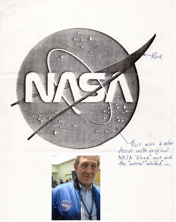 Sketches of the first “wormball” as originally conceived and proposed by James Modarelli in 1975 shortly after the NASA “worm” logotype replaced the meatball. Photo inset shows a NASA “wormball” patch on the flight jacket of retired shuttle astronaut Mike McCulley while attending an Astronaut Scholarship Event at the Kennedy Space Center in 2010. (credit: Jim Modarelli and Francis French) |
The Wormball
In spite of Goldin’s best effort to eradicate the worm, the 1975 logotype never really went away.
It seems that the government agency in charge of moving other government agencies did not get the memo about the worm eradication. Shortly after Goldin’s 1992 announcement, NASA moved its Washington headquarters to a new location. The new NASA building has etched in stone on its outside wall, a giant NASA worm that remains to this day.
When I first wrote about the origins of NASA’s insignia for Quest back in 1992, I included mention of how NASA should combine both the worm and the meatball into one design. An image of the new “wormball” (for lack of a better name) accompanied the article along with artwork showing variations of the new hybrid made by the late artist and good friend Daniel James Gauthier. The article proved popular and even Jim Modarelli chimed in on it by writing to me: “It was interesting to find Dan Gauthier superimpose the ‘worm’ over the ‘meatball’ since I submitted an almost identical design to NASA Headquarters shortly after the NASA worm logo was adopted in 1975. Naturally, it was turned down by them with a little help from the worm contractor Danne & Blackburn.”[26]
At that time, I asked Robert Schulman if the wormball had possibilities. Schulman, who was then Director of NASA’s Art Program and Curator of Art for the agency’s space art collection, responded with a terse “no.”[27] Wearing a small NASA worm in his lapel, Schulman did not agree with Goldin’s decision to replace the space agency’s logo. Schulman was a member of the Graphics Evaluation Panel for the National Endowment for the Arts and a recipient of the First Presidential Award for Design Excellence in 1984 in part, for the agency’s use of the worm in its visual communications programs.[28]
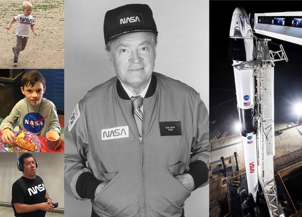
| Have NASA emblems become a fashion statement? Do people wear them because they are trendy without realizing what they mean? |
Even though Goldin sought to remove all signs of the worm from the agency, a few logo loyalists worked behind the scenes to press for a full-up adoption of the wormball as NASA’s official insignia. This included NASA’s own Public Affairs Office at the Johnson Space Center, who directed their in-house graphics department to work up an animation with the worm in the meatball. During the STS-52 shuttle mission, the crew deployed the Laser Geodynamics Satellite. After the live television transmission showing a successful deployment was complete, NASA Select Television was briefly interrupted and replaced by a full color animated NASA wormball complete with orbiting satellite. Appearing for a full ten seconds, the wormball was shown to viewers from coast to coast on October 23, 1992 at 9:40 am EST.[29]
NASA as a brand
Back in the ’80s, I used to work at the Michigan Space Center in Jackson, Michigan. The center has long since closed but one of the things that we gave out were plastic gift shop bags featuring artwork of the unique domed building that housed the museum. Along with the printed artwork, the center director made sure that the NASA worm was included on the bag. After we received a warehouse full of bags from our supply vendor, we got a call from NASA informing us that we could not use them because the NASA insignia promoted or endorsed a product. They were fine if the bags only had the NASA emblem on them but as soon as they appeared along with something that was not approved or made the appearances of an endorsement, this was in violation of the agency’s federal guidelines. The insignia had to go. Rather than toss the bags, the Space Center’s director made up stickers which I spent days applying to each bag to cover up the illegal NASA worm.
Since that time, it seems that NASA insignias have appeared everywhere. Several years ago, while at the Amsterdam airport, I saw the NASA worm on a passenger’s t-shirt. At Disneyland, I saw people walking around the theme park carrying backpacks or wearing t-shirts or hoodies featuring both the NASA worm, the meatball, and variations of space shuttle mission patches.
Even though the agency has not recently been in the headlines, NASA seems to be popular—or, at least, the emblem does. Have NASA emblems become a fashion statement? Do people wear them because they are trendy without realizing what they mean?
It seems to have started with Target. A number of years ago the store began marketing a line of NASA apparel that proved surprisingly popular. Other clothing brands soon took notice. In 2017, Coach starting selling wallets and totes ablaze with the iconic emblems. Nike sold limited edition sneakers with the meatball and designer Vivienne Tam produced a line of apparel featuring the “NASA look.” (See “NASA as a brand”, The Space Review, August 6, 2018.)
From t-shirts to gym bags, NASA clothing seems to have flooded the market. There are no licensing fees because these emblems are funded by taxpayer dollars since, in keeping with its public mission, NASA cannot not make a dime off of any of this. But is there more to this trend other than the fact that retailers do not have to pay licensing fees, thereby making some of these products relatively inexpensive for their consumers to purchase? Not everyone needs to buy a pair of Nikes or other high-end designer labels as there are plenty of other outlets such as Target and online retailers where shoppers can go to get inexpensive NASA wear.
“Very, very few brands have broad appeal,” said Utpal Dholakia, marketing professor at Rice University, in an article that appeared in the Los Angeles Times around the time of the 50th anniversary of the first Apollo moon landing. “NASA fits into the mold where it not only has broad appeal, but there is almost nothing to dislike about it.”[30]
The NASA emblem taps into a sense of universal wonderment about what is good in this world because it was one of the few entities that successfully allowed us to leave it. After all, those footprints on the moon and the rover treads on Mars came from NASA and we were there to see them happen if not in person, then remotely. Nostalgia is a powerful marketing tool and a profitable one.
In 2015, graphic designers Jesse Reed and Hamish Smyth launched a Kickstarter campaign to republish the official NASA Graphics Standards Manual that was developed by the design firm that created the NASA worm back in 1975. They only needed $158,000 to meet their goal and ended up raising more than ten times that. Today, it is in its fifth printing with more than 30,000 copies sold.[31]
| The stars and stripes are also present, shown placed between the two emblems almost as if a peacemaker, beckoning the two historically different graphics to declare a truce. |
There is also a geek factor at play here. Even though NASA has not sent humans to the Moon in almost 50 years, the agency remains cool. Other federal agencies don’t have that same appeal. After all, you don’t see apparel with the logos for the National Park Service, EPA, or even the IRS flying off the shelves (in all fairness, it should be pointed out that the National Parks service does not allow its symbol to be licensed for consumer merchandise.) NASA is different because it is usually associated with spaceflight, the future and other forward-thinking things. Most people forget the first “A” in NASA stands for aeronautics. But even if people are not flying through outer space aboard a space shuttle or soaring through the air in a T-38, NASA helped us do both and therefore has an appeal that cannot be met by simply filling out your taxes.
And that appeal is universal. NASA has a very positive reputation. It seems that everyone knows what NASA is and likes it. NASA is not only futuristic and nostalgic but also patriotic and apolitical. People feel at ease talking about it.
Bert Ulrich, NASA’s multimedia liaison in charge of logo approvals, notes that the agency’s current graphic standards does not allow both the worm and the meatball to be seen in the same space “because they are from two different time periods and would never have appeared together.”[32]
But things change.
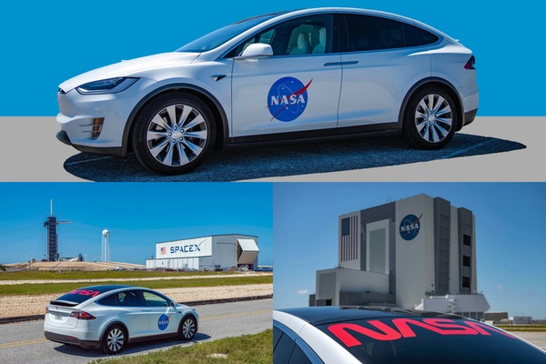 A Tesla Model X SUV will serve as the astronaut transfer vehicle for the upcoming SpaceX Demo-2 launch. The all-electric vehicle comes complete with NASA meatball and worm. (credit: SpaceX) |
The Worm and Meatball are here to stay
With the upcoming SpaceX launch, two Americans will be sent into space to dock with the International Space Station. Painted on the side of the first stage of their reusable SpaceX Falcon 9 rocket is not only a set of giant NASA worms but also a few very big meatballs. The stars and stripes are also present, shown placed between the two emblems almost as if a peacemaker, beckoning the two historically different graphics to declare a truce.
“I grew up in the ’80s,” said NASA Administrator Jim Bridenstine in an interview with the New York Times where he talks about NASA’s recent decision to bring back the worm. “In the ’80s, the worm logo was the logo of NASA. I’ve always been kind of partial to it.”[33] In the Times article, Bridenstine indicates that NASA is working to find a wider roll for the worm noting that, “when the Starliner launches, it would likely have the worm as well.” Bridenstine tweeted, “We’re bringing back the worm, but the NASA meatball isn’t going anywhere.”[34]
Before the two astronauts launch into space, they will first hitch a ride out to the launchpad. On May 13, Bridenstine announced that one of Elon Musk’s Tesla Model X SUVs will transport the two astronauts the 14 kilometers from NASA’s Operations and Checkout Building at the Kennedy Space Center to Launch Complex 39A.[35]
NASA has traditionally used either a trailer or specially equipped “Astrovan” to carry its astronauts and support personnel to their waiting rockets. These earlier modes of transportation were more spacious than the backseat of a sedan but Tesla’s all-electric car comes equipped with a standard set of falcon-wing doors which may make it easier for the ingress and egress of fully suited astronauts minus their luggage.
The white Tesla SUV is also fully adorned with a set of large NASA meatballs on each of its two passenger doors along with the agency’s newly resurrected worm logotype that can be seen inching across the exterior of the car’s rear window.
In spite of its popular emblems and positive public support, the agency has had an image problem. Though NASA has made headlines with its highly successful robotic space programs, the agency has sometimes been given second billing by the press. For example, when NASA’s Curiosity rover landed on Mars in 2012, many people did not realize that it was a NASA vehicle because so much press was given to the Jet Propulsion Laboratory, which managed the mission.
Since the shuttle program ended in 2011, NASA’s human spaceflight program has faced even more challenges to its image. To fly into space, astronauts have had to take a back seat to its Russian hosts as they rely on its once Cold War rival, the former Soviet Union, to hitch a ride on one of their spacecraft to go to and from the International Space Station. In the meantime, SpaceX has been getting lots of publicity, to the point where the general public thinks that SpaceX is the space program.
| This is a unique case where people at NASA have noticed how the culture is treating them, rather than the other way around, and as a result, they are trying to tap into that popularity. |
The upcoming SpaceX Demo-2 mission is a high-profile event both for Musk’s company as well as for NASA. The significance of this launch cannot be overlooked and neither can its public relations potential. People are going to look at this event and think it is a SpaceX mission, and NASA wants the public to know that they are still in charge and pay the bills.
The fact that SpaceX is ready to send two NASA astronauts into space using an American-made rocket launched from US soil is historic. But at the same time NASA wants to send a message that they did not go out of business when the shuttle retired. One of the most visible means for the agency to do so is to slap their logos on the rockets (and cars) that will help get them back into the human spaceflight business.
People are walking around in t-shirts, wearing caps, and carrying tote bags adorned with the NASA meatball and worm even if they don’t fully understand what these symbols mean. Some of those who sport the designs might learn about their significance on their own, but it helps if they are provided with visible public reminders such as the upcoming SpaceX launch that show how both the meatball and the worm represent NASA. Now with the agency’s new directive to use both of its iconic emblems, it will be easier for people to make that association. If retailers can cash in on NASA’s image by selling products that exhibit both the agency’s emblems, the resulting free publicity can only be of benefit to NASA. This is a unique case where people at NASA have noticed how the culture is treating them, rather than the other way around, and as a result, they are trying to tap into that popularity. Bridenstine’s decision to bring back the worm to join the meatball as dual symbols of NASA is a smart move and will restore peace to the galaxy.
Endnotes
- The Worm is Back! NASA Press Release April 2, 2020.
- Author interview with James Modarelli conducted on July 8, 1992.
- Author interview with James Modarelli conducted on July 8, 1992.
- Author interview with James Modarelli conducted on July 8, 1992.
- South, Jr. Jerry C., “Meatball Logo Based on Wind Tunnel Model,” The Researcher News, in-house newsletter, NASA Langley Research Center, August 14, 1992, p. 2 Also, Roy V. Harris, Jr., interview by Joseph Chambers, November 1, 2012.
- Author interview with Joseph R. Chambers conducted on March 19, 2020.
- Chambers, Joseph R. and Chambers, Mark A., Emblems of Exploration: Logos of the NACA and NASA, Monograph in Aerospace History, no. 56., NASA SP-2015-4556, pp. 64-65.
- Author interview with James Modarelli conducted on July 8, 1992.
- Gavin Memorandum to John F. Victory. October 6, 1958. NASA Headquarters Historical Records Collection, file 4540. The file includes very poor copies of the designs.
- “Insignia Incorporates Features Contained in Number of Suggestions,” Langley Air Scoop, in-house newsletter, July 31, 1959, Volume 18, Issue 30, p. 1.
- Author interview with James Modarelli conducted on July 8, 1992.
- Chambers, Joseph R. and Chambers, Mark A., Emblems of Exploration: Logos of the NACA and NASA, Monograph in Aerospace History, no. 56., NASA SP-2015-4556, pp. 66-67.
- See NEA, “Setting the Standard: The NEA Initiates the Federal Design Improvement Program”
- Greenbaum, Hilary, “Who Made Those NASA Logos?” New York Times, August 3, 2011; Also excerpt from Dust Bowl to Gotham by Richard Danne.
- “Employees Rededicate Famous NASA Symbol.” The Lewis News, in-house newsletter, Volume 34, Issue 11, November 1997, p. 1.
- Copy of memo from Jim Modarelli included as part of correspondence to the author received September 3, 1992.
- Paul F. Holloway, telephone interview by Joseph Chambers, July 15, 2013.
- Chambers, Joseph R. and Chambers, Mark A., Emblems of Exploration: Logos of the NACA and NASA, Monograph in Aerospace History, no. 56., NASA SP-2015-4556, p. 105.
- “Administrator Goldin Brings ‘New NASA’ Message to Langley,” Researcher News, in-house newsletter, Volume 6, Issue 9, June 5, 1992, p. 5.
- Letter from Lawrence J. Reeves, President Systems Research Associates, Los Altos, California, Space News, Vol. 3 No. 27 July 27-August 9, 1992, p. 18.
- Sawyer, Kathy, “Logo Change Sends NEA Into Orbit,” Washington Post, June 15, 1992.
- Letter addressed to Goldin from Mina Wright Berryman dated June 4, 1992.
- Letter from Dave Dooling in Huntsville, Alabama, Space News, Vol. 3 No. 27 July 27-August 9, 1992, p. 18.
- Anonymous interview by author.
- Jim Modarelli, telephone interview by author, July 9, 1992.
- “More on the ‘Meatball,” Quest The History of Spaceflight Magazine, Volume 1 No. 3, Fall 1992 , p. 45.
- Author interview with Robert Schulman after a presentation on NASA’s Art Program given during the Eighth Annual Midwest Space Development Conference in Columbus, Ohio.
- “More on the ‘Meatball,” Quest The History of Spaceflight Magazine, Volume 1 No. 3, Fall 1992 , p. 45.
- Letter dated October 27, 1992 to the author from Andrew Parris including videotaped footage of the NASA wormball which aired during STS-52.
- Masunaga, Samantha and Mensik, Haily, “The NASA logo is having a Moment,” Los Angeles Times, July 19, 2019.
- Chang, Kenneth., “NASA’s ‘Worm’ Logo Will Return to Space,” New York Times, April 8, 2020.
- Masunaga, Samantha and Mensik, Haily, “The NASA logo is having a Moment,” Los Angeles Times, July 19, 2019.
- Chang, Kenneth., “NASA’s ‘Worm’ Logo Will Return to Space,” New York Times, April 8, 2020.
- Bridenstine, Jim, Twitter message, April 8, 2020.
- Bridenstine, Jim, Twitter message, May 13, 2020.
Note: we are temporarily moderating all comments submitted to deal with a surge in spam.